What’s Broken in iOS for iPhone X
March 28th, 2018 by Oleg AfoninCategory: «General», «Security», «Tips & Tricks»
Apple’s latest and greatest iPhone, the iPhone X, received mixed reviews and sells slower than expected. While the high price of the new iPhone is a major factor influencing the slow sales, some of the negative points come from the device usability. The combination of design language, hardware and software interactions make using the new iPhone less than intuitive in many situations. In this article, we collected the list of utterly strange design decisions affecting the daily use of the iPhone X.
The Return of Slide to Unlock
In iOS 10, Apple has finally rid of the infamous “slide to unlock” prompt, replacing it with the prompt to that asks iPhone users (as well as users of Touch ID equipped iPads) to press the home button to gain access to the home screen. This means that, by default, users could no longer simply rest their finger on the home button to unlock their device with their fingerprint.
A workaround was discovered quickly. Apparently, it was possible to alter the “Rest Finger to Open” option in General > Accessibility > Home Button to make iPhones capable of “raise-to-wake” unlock without pressing down on the home button.
This option is still present in iOS 11, and still works on all devices equipped with Touch ID – but not Face ID. The iPhone X is the only device in Apple’s stable that cannot be automatically unlocked when picked up. Users must still reach for the very bottom of the device’s screen and… yes: swipe up to unlock. This feels like a huge step back to pre-iOS 10 days, and annoys many users.
Installing Apps from the App Store: May The Force Be With You
The iPhone 6s was the first phone to use 3D Touch (Apple Watch was already using the technology) introducing force-based interactions. This controversial approach received mixed reviews; it was much criticized in Opinion: Force Touch is a paradoxical complication in the world of sublime simplicity and similar publications. Usability experts warned against mixing the two types of interaction (tapping and using force) within the same user interface.
Unexpectedly, iPhone X takes this controversy to the completely new level. With iPhone X, and iPhone X only, getting a new app from the App Store, in addition to the usual authentication, now requires physically pushing the Power button. Twice.
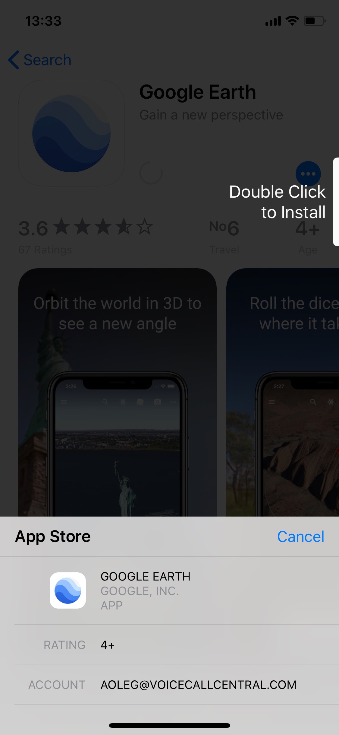
Honestly, I was baffled by this decision. I could not imagine that someone in their right mind, and especially Apple, whose UI designers used to do great in the past, would invent something as counterintuitive as that. I tried double-clicking the “Double-click” prompt to no avail. It was several minutes later when I realized I was expected to push the Power button. Twice. To install an app. Blah.
The Multitasking View
The multitasking view has not radically changed in iPhones since iOS 8. The familiar cards invoked with the double press of the Home button (or swipe up gesture on iPads) could be swiped up to be dismissed.
Not so in the iPhone X. First, you cannot simply swipe up from the bottom of the screen to get to the multitasking screen (this gesture is reserved for the “Home” activity). What you must to is swiping and holding, which is not the most intuitive or convenient gesture. Fortunately, Apple provided an alternative way to call up the multitasking view by swiping up and dragging right in a Г-shaped fashion.

This was the good part. The bad part is you cannot simply swipe an app up to close. Instead, you have to tap-and-hold on a card until a small red “X” icon shows up. Only then you can tap on that “X” or, better yet, swipe the card up.

Dear Apple, why do we have to do it this way? If we can swipe the card up, why on Earth do we have to play this tap-and-hold game?
The Mysterious Power Button
In all iPhones (and all other smartphones in existence, if it ever matters), switching the phone off is as simple as holding down the Power button. Not in iPhone X. There are numerous YouTube videos, some with thousands of views, teaching users on how to shut the freaking thing off! If that’s not an indication of a bad design decision, I don’t know what would count as one.
For whatever reason, Apple decided to use the Power button in a different manner. In iPhone X, the Power button (or Sleep/Wake button, as it is frequently referred), perform different actions depending on many conditions.
- If the phone is off, the button will turn it on.
- If the phone is on, screen locked, the button will turn on the display.
- Pushing and holding the button will invoke Siri.
- Three (or five) clicks of the button will invoke the S.O.S. mode, unless something is changed in the Assistive Touch > Accessibility Shortcut.
- If an Accessibility Shortcut is activated in the Settings app, three clicks of the button will do that action instead of the S.O.S. mode; the S.O.S. mode can still be invoked by pushing the Power button and either of the Volume keys.
From all of that, did you see a hint on how to switch the phone off? You’re right: invoking the S.O.S. menu does the trick! To power down the iPhone X, users will need to hold both the Power button and one of the Volume keys, then slide the Power Off slider.
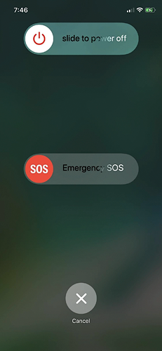
Al of that could be easily avoided should Apple add a top button, or should it add another side button on either side of the phone that could be used to call Siri (or maybe used for quickly launching the Camera app, as many Android and Windows 10 Mobile devices do).
The Navigation Bar
On the bottom of the display, the iPhone X has a prominent new feature: the navbar, or the home indicator. This UI element is an essential part of the design language used in iPhone X’ version of iOS 11. Its importance is discussed in Opinion: Why the home indicator is an essential part of the iPhone X interface.
The author, Benjamin Mayo, mentions that “Whilst it does a good job most of the time, there are a couple cases I have noticed where it is too distracting. Take the iTunes Store movie section for example (screenshot above). This is a dark interface with dark controls and gray text. iPhone X determines the home indicator should be 100% white in this scenario.”
“This is not ideal. The stark white rounded rectangle is a jarring imposition on this toned-back interface of blacks and dark grey. The iPhone X’s high-contrast OLED display only exacerbates this effect. I mocked up a comparison of a better color palette choice:”

I can only agree with his opinion.
Conclusion
The iPhone X is a set of compromises. In this review, I haven’t touched any of the hardware decisions such as The Notch or using glass for the back panel (arguing that we only charge it every so often, but we have to hold it all the time; and yes, it breaks, and is utterly expensive to replace). Instead, we covered the many inconsistencies introduced by the version of iOS 11 targeted to run on this model. We are sure that Apple can do much better than this.

- iOS Forensic Toolkit 10.10 adds pairing-free sideloading of the extraction agent24 June, 2026
- Elcomsoft Phone Breaker 11.2: downloads iOS 26 iCloud backups18 June, 2026
- Elcomsoft Phone Breaker 11.1: reliable iCloud backup extraction26 May, 2026
- ElcomSoft Phone Breaker 11: full overhaul of iCloud extraction30 April, 2026
- iOS Forensic Toolkit 10.02 adds agent-based extraction for iOS 2629 April, 2026